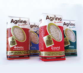
Agrino Rice - Packaging Revitalization
The Challenge: Agrino is the number one Greek brand in packaged rice and pulses. While commercially the brand has been gaining recognition and market share, the packaging has stayed behind and was in urgent need of revitalization. Brandessence was commissioned for the re-branding of the entire core line of products, including all types of rice and pulses. Different packaging, colors and even Agrino logos, were used on different SKUs.
The Solution: Brandessence started the re-vitalization project by developing a branding architecture. A common packaging look was developed, including logo and packaging architecture. A window in the shape of a rice grain, was utilized in order to push further the brand’s association as a leader in the rice category and at the same time satisfy the consumer’s need for viewing the product. Since the product manufacturer was packaging the product in-house, certain printing limitations had to be taken into account while designing the packaging. The outcome was a consistent brand image for all SKUs, which treats the Agrino brand as the hero, on pack.

