Multirama - Corporate Identity Revitalization
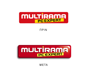
The Challenge: The Multirama brand was in need of an updated look, without losing its character, personality and equity.

The Solution: The corporate logo was revitalized by applying a systematic, step-by-step approach. As a first step, typeface alternatives were explored. Following that, design alternatives for the descriptor, PC Expert and the logo’s shape were explored. Finally, the entire logo was given a 3D dimension. The new logo, has maintained the original logo’s personality and equities and through careful design steps has been modernized and brought up to-date.

