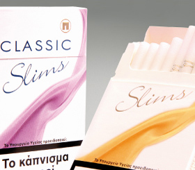
Classic Slims - New Line Extension Development
The Challenge: Papastratos/Philip Morris wanted to extend the Classic cigarette brand into the Slims category. The new Slims line extension should not resemble the core Classic packaging. The only connection between the current and the new line extension would be the Classic name. Two SKUs would be developed Lights and Ultra Lights.

The Solution: As a first step in the packaging development, Brandessence / CBX identified the brand’s critical attributes. Femininity, elegance and premium ness, were identified as the 3 most important brand attributes. In addition, critical branding parameters relevant to the cigarette category where taken into account. The white background as well as clean and “thin” graphic elements was selected in order to communicate a) category cues (whiteness), b) the slim cigarette and c) elegance. The descriptors Lights and Ultra lights cannot be used on the packs due to legal prohibitions. Thus, Brandessence / CBX recommended to follow the Classic regular’s color coding and use the mauve and gold colors to differentiate the 2 SKUs. The Classic Slims logo was selected because it communicates slimness and elegance.
